
Manage risk with drawdown, not hope
Compute max drawdown in pandas and set pragmatic risk limits
Each week, I send out one Python tutorial to help you get started with algorithmic trading, market data analysis, and quant finance. You can subscribe for free. If you need support with code or strategy design, join our network. You’ll instantly join our group chat and get access to the code notebooks. Grab an Alpha Lab membership to get monthly backtested trading strategies.
In today’s post, you’ll compute drawdown and rolling max drawdown, then visualize an underwater chart you can reuse.
What is drawdown
Drawdown is the peak to trough decline of cumulative returns, which quantifies the depth and timing of losses.
Early hedge funds and commodity trading advisors reported performance using underwater charts because investors cared about pain, not just averages. After the 2000 and 2008 selloffs, drawdown became a standard risk statistic in allocator reports and academic performance evaluations.
How pros use it
That history turned into a simple operational rule across quant teams today.
Production pipelines compute cumulative returns intraday, update the running maximum, and store a drawdown series for dashboards. Risk teams watch rolling max drawdown over fixed windows to detect regime shifts and to trigger de‑risking rules. Portfolio managers use drawdown limits to cap exposure, to pause signal deployment during model drift, and to calibrate position sizes against cash buffers.
Why beginners should care
This is one of the fastest ways to make early backtests honest and to avoid fragile strategies.
When you track drawdown, you stop optimizing only for average return and start managing risk where it happens. Your tests become easier to compare across assets, your sizing becomes more defensible, and your expectations stay realistic during stress.
Let’s see how it works with Python.
Library installation
Install the libraries needed to download market data, compute vectorized metrics, and render plots so the notebook runs end to end.
yfinance gives us quick access to historical prices, pandas handles time series, numpy powers fast array ops, and matplotlib lets pandas render the underwater charts. Installing them up front avoids environment surprises when we get to plotting and rolling calculations.
Imports and setup
We use yfinance to download SPY price history for the study period, and numpy for vectorized operations used inside the drawdown calculations.
Keeping imports minimal mirrors production pipelines where dependencies are kept lean and predictable. yfinance is fine for tutorials; in production you would typically swap in a data vendor but keep the same numpy-based logic.
Fetch price data and returns
Pull SPY daily prices for the sample window and transform them into simple daily returns, which are the input to our drawdown functions.
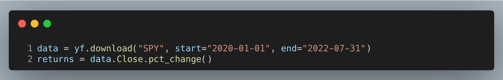
Using adjusted close aligns with what we care about: investable returns including dividends and splits. pct_change introduces a leading NaN, which is expected and handled later; the important part is we’re creating a clean, noncumulative return stream that we can roll up into an equity curve.
Define drawdown utilities and metrics
Implement a vectorized drawdown series and a companion max drawdown function so we can reuse the same logic in backtests, dashboards, and rolling risk checks.
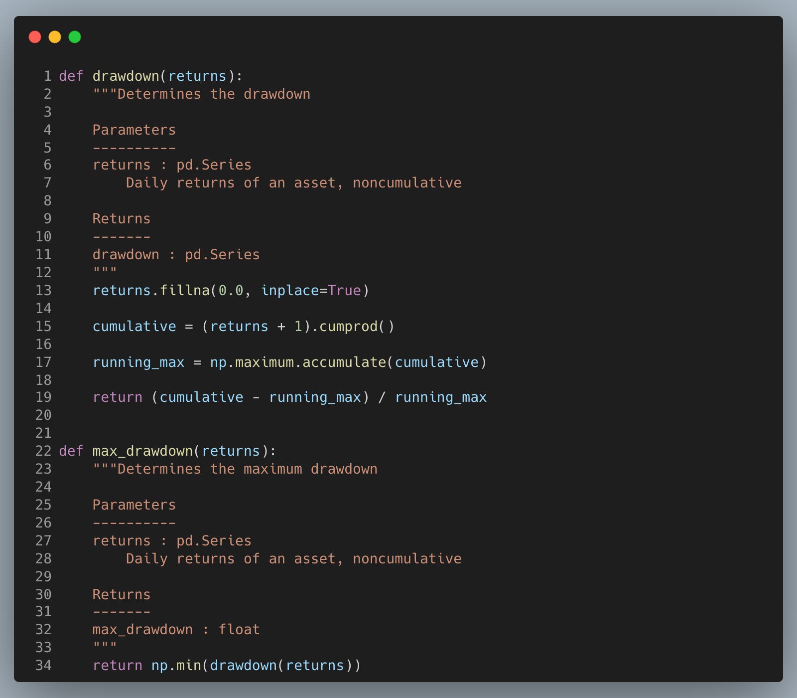
The drawdown series tracks how far underwater we are relative to the running peak, which is how pros experience risk day to day.
Filling NaNs with zero avoids contaminating the cumulative product at the start; note this mutates the input Series in place, so pass a copy if you need the original untouched.
The minimum of the underwater series is the max drawdown, the single pain number allocators and risk teams anchor on.
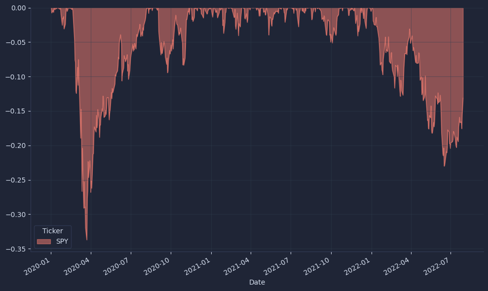
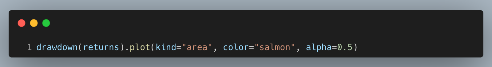
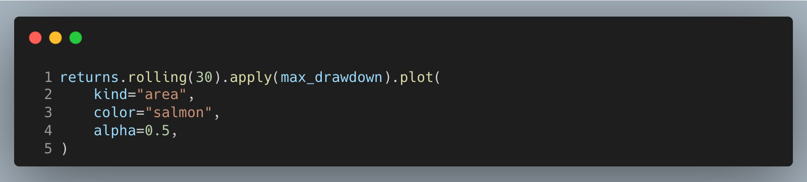
Plot underwater and rolling risk
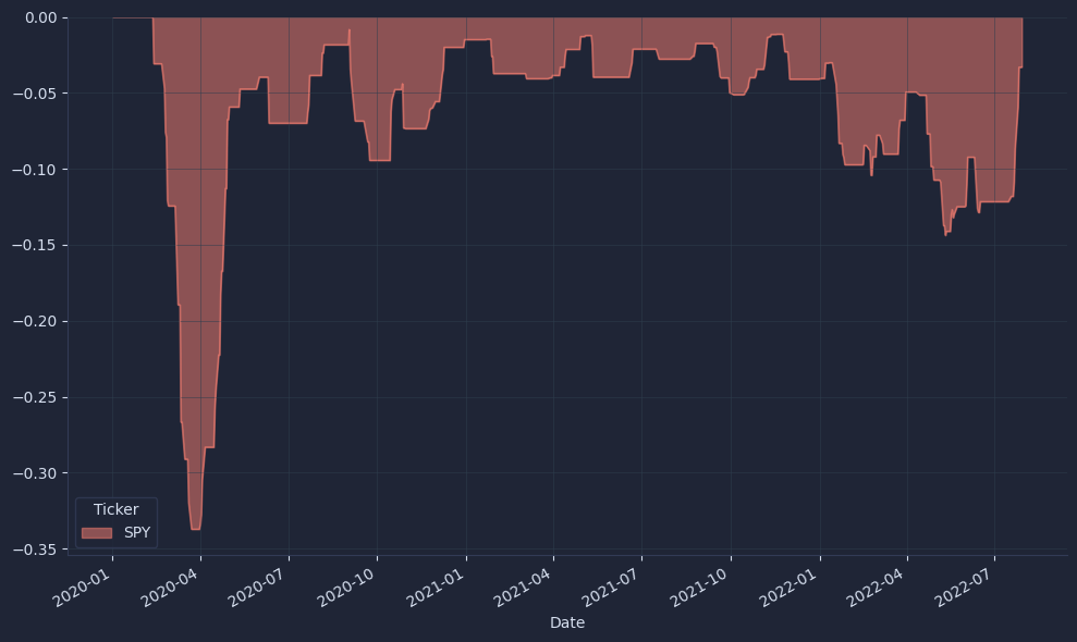
Visualize the full-sample underwater curve, then a 30-day rolling max drawdown to spot regime shifts and trigger de-risking rules earlier.
The underwater area chart shows the depth and duration of capital losses, which is more decision-relevant than average return when markets stress.
The result looks something like this.

Rolling max drawdown highlights localized pockets of pain that get averaged away in full-sample stats, making it a practical alert for position sizing and pause rules.
The result looks something like this.
In production, this series feeds a dashboard and simple thresholds to keep risk within cash and mandate limits.
Your next steps
You can now compute drawdown and rolling max drawdown from your returns and plot an underwater chart, so you see peak‑to‑trough losses as they happen. Use these series to set drawdown limits, size positions, and define recovery triggers—practical rules that preserve capital and keep you invested when markets turn.