
🐍 Options models are wrong
Build an implied volatility surface with free data from Yahoo Finance and Python
Each week, I send out one Python tutorial to help you get started with algorithmic trading, market data analysis, and quant finance. Upgrade to a paid plan to access the code notebooks.

In today’s post, you’ll pull live options chains, inspect skew and term structure, and plot a 3D implied volatility surface.
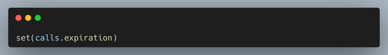
What an implied volatility surface is
An implied volatility surface is a grid of implied volatilities across strike prices and expirations, built from market option prices.
The idea became mainstream after the 1987 crash made it obvious that constant-volatility models miss real pricing patterns. As equity index options matured in the 1990s, desks started treating skew and term structure as first-class inputs, not chart curiosities.
How pros use it
That history shows up directly in modern workflows, because volatility surfaces sit between raw option quotes and real pricing decisions.
On a derivatives desk, you’ll usually start by pulling the full option chain, filtering obvious quote issues, and organizing it into strike-by-maturity form so you can see structure quickly. Risk teams use the same surface view to sanity check model marks and explain why a book’s sensitivity changes when the skew shifts. Systematic shops also use surface features as data inputs, for example tracking how short-dated implied volatility moves relative to longer maturities around macro events.
Why it’s worth learning
Once you can build a surface, you stop treating options data as disconnected rows and start treating it as a coherent object you can test.
You’ll also make fewer beginner mistakes like comparing implied volatility across expirations without aligning strikes, or plotting noisy points without realizing you need filtering and reshaping first.
Let’s see how it works with Python.
Library installation
Install the third-party libraries used to pull option chains and plot the volatility surface so the notebook runs end-to-end on a fresh environment.
If you are running in a locked-down environment (some corporate JupyterHub setups), you may need to ask for yfinance to be whitelisted or installed via your platform’s package manager instead of pip.
Imports and setup
We use datetime for “days to expiration,” pandas for reshaping the option chain into a grid, numpy for meshing coordinates for 3D plotting, matplotlib for charts, and yfinance to fetch live option chains from Yahoo Finance.
Pull every listed expiration for a ticker and standardize the result into one DataFrame so we can later compare strikes and maturities as a single surface instead of isolated rows.
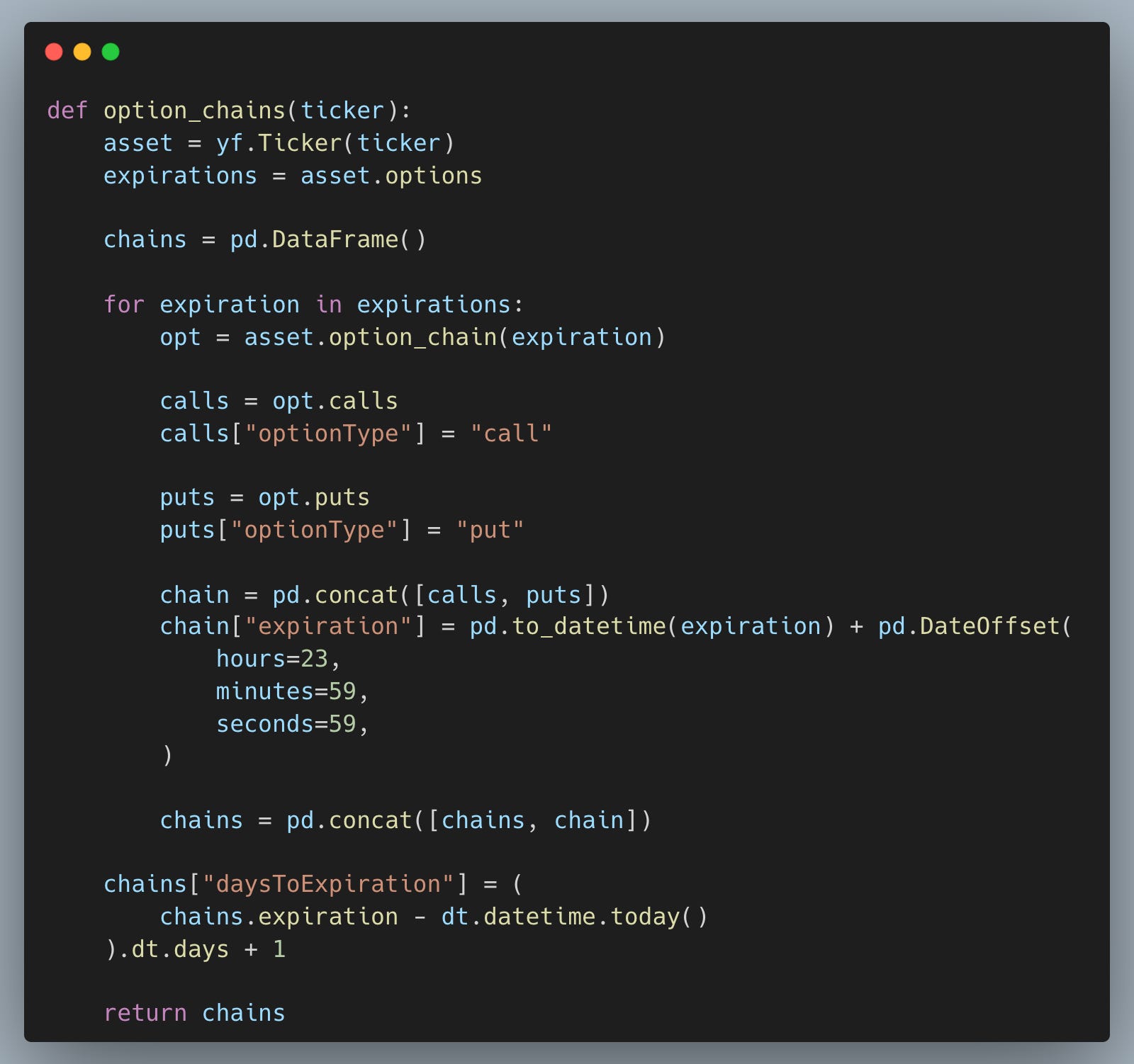
This “one table” shape is the bridge from raw quotes to analysis: once the chain is consolidated, we can slice skew, slice term structure, and then reshape into a strike-by-maturity grid. Adding a consistent expiration timestamp also avoids subtle grouping bugs when expirations come in as strings.
Pull options chain across expirations
Fetch SPY’s full option chain and isolate calls so our first surface focuses on one option type with a cleaner skew signal.
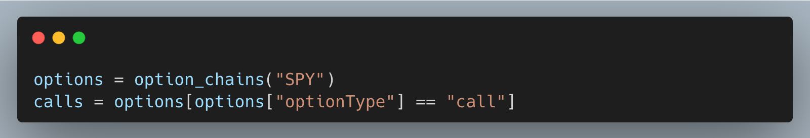
Working with a liquid ETF like “SPY” helps because you typically get enough strikes and expirations to see real structure rather than sparse, jumpy points. Splitting calls and puts early is also practical because the skew often differs by type due to supply/demand and moneyness conventions.
Quickly list expirations available in the downloaded data so we know what maturities we can build the grid from.
This check is a small but useful workflow habit: when beginners think “the data is wrong,” it’s often just that the expiry set changed or a filter removed most rows. Seeing the available expirations keeps our later slices and plots grounded in what we actually pulled.
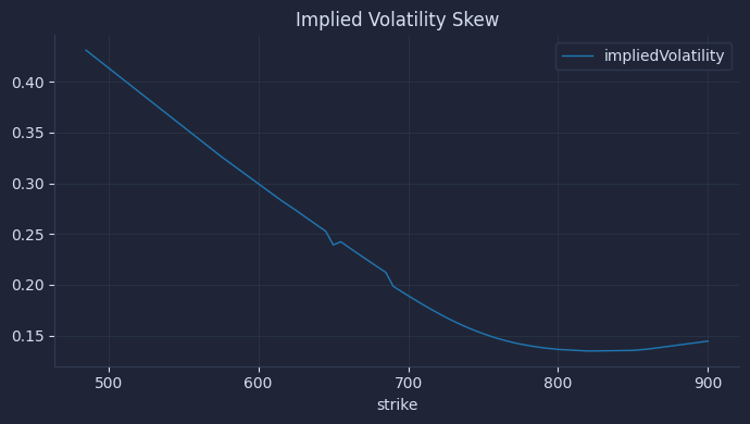
Slice skew and term structure
Take one expiration to study skew across strikes, and take one strike to study the term structure across expirations, filtering out near-zero implied vols that are usually stale or broken quotes.
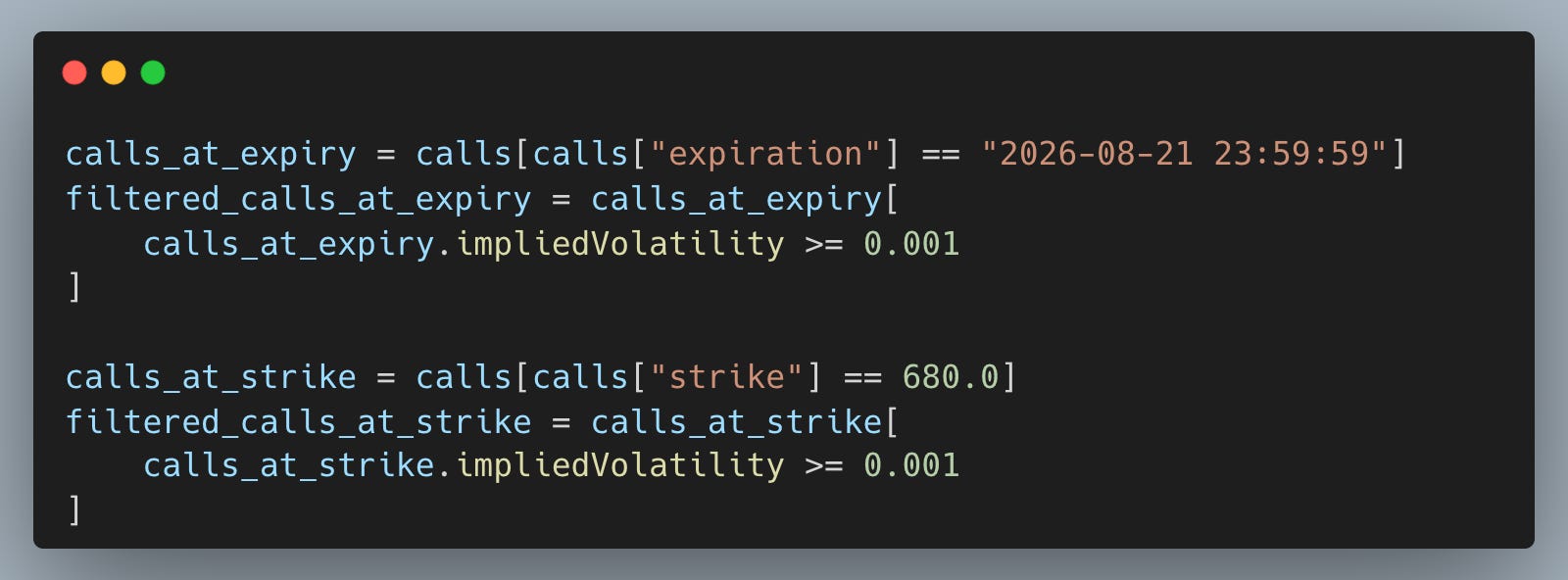
These two “1D cuts” are the simplest way to stop thinking in single-vol terms: skew tells us how vol changes with strike, and term structure tells us how vol changes with maturity. The small impliedVolatility filter is not cosmetic; it prevents a few bad points from dominating the chart and misleading our interpretation.
Reshape call implied vols into a strike (rows) by days-to-expiration (columns) grid, which is the core object we need for a clean surface plot.
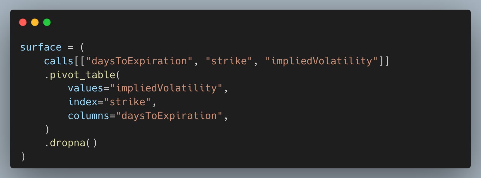
Pivoting is the “professional workflow” step in this post: it turns a long options table into a coherent surface you can sanity check, model, and compare over time. Dropping NaNs is a pragmatic way to get a rectangular grid for plotting, but it also teaches an important lesson that real option chains are incomplete, so filtering choices shape what you see.
Plot the skew at a fixed expiration and the term structure at a fixed strike so we can visually confirm structure before moving to 3D.
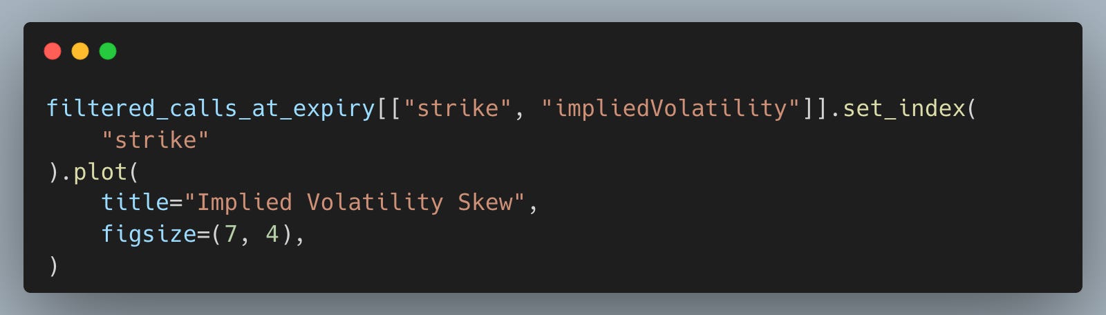
The result is a volatility skew chart.
And the term structure.
Here’s the chart.
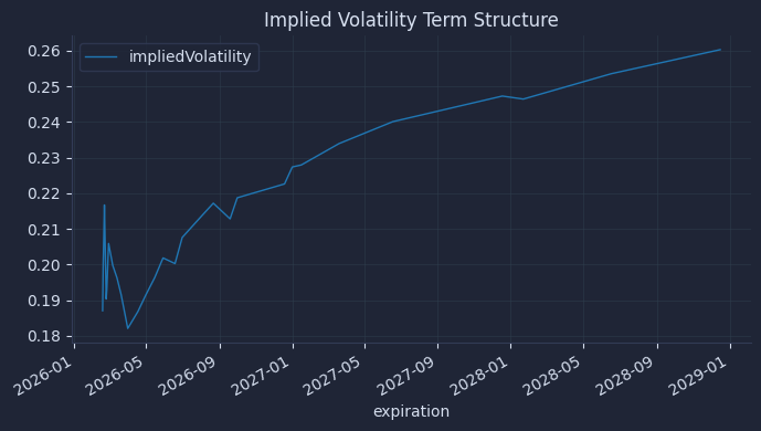
These plots act like unit tests for our surface: if skew and term structure look unreasonable, it’s better to debug filters and data alignment here than after a 3D plot hides the issue. In practice, desks will check these slices routinely because they map directly to common risk narratives like “skew steepened” or “front vol jumped.”
Plot the full implied vol surface
Build a 3D surface plot from the grid so we can see skew and term structure together as one object rather than flipping between expirations by hand.
The result is a plot that looks like this.
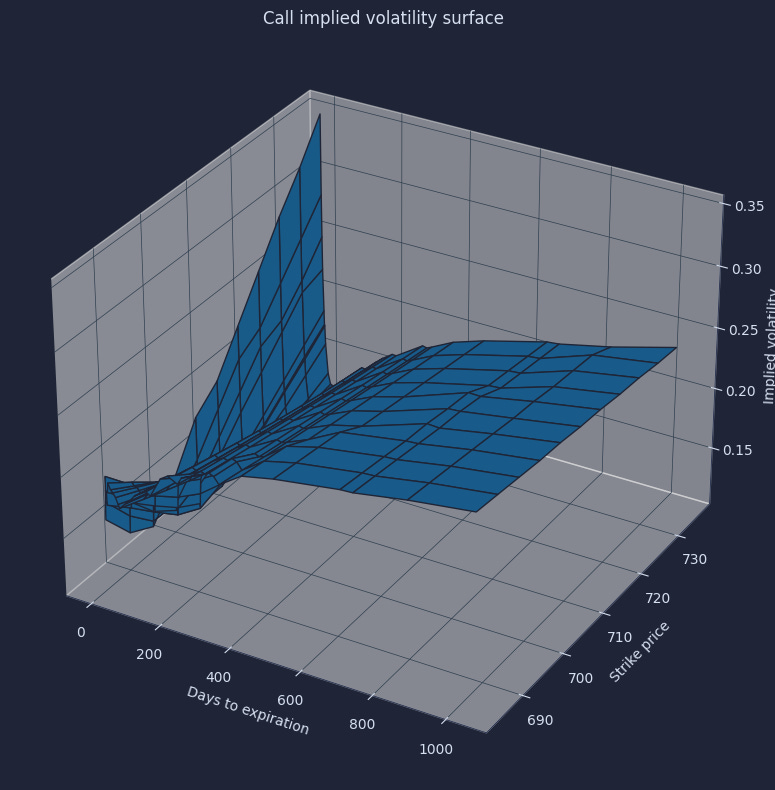
The surface is the payoff: it makes market structure obvious and helps us avoid false “bad data” hunts when the shape is actually real pricing information. Once we have this, we can start asking better questions, like which region of the surface moved after an event or whether our hedges are sensitive to skew versus overall vol level.
Your next steps
You can now pull a live options chain, reshape it into a strike-by-maturity grid, and plot a clean 3D implied volatility surface so skew and term structure are obvious. In practice, that surface is the quickest way to separate market structure from quote noise and to explain pricing and hedge behavior without relying on a single “one-number” vol.
Very well written. I finally am starting to grasp the surface concept. I remember when it was introduced to me while I was at Bloomberg in early 2000’s and we had to learn all this confusing garbage terminology to explain this 3d chart. Here are some of my notes. https://readwise.io/reader/shared/01kj064bjs8rcdyy4ke8zj3ke3/