
🐍 How to start profitable research
Test the boring stuff first (and fast)
Subscribers, look for the code in your Private chat. Looking for the code notebooks? Consider a free subscription.
Simple calendar effects in bond ETFs can still produce measurable trading edges.
Most beginners assume only complicated models can justify time and capital. In practice, structural flows often create small but steady patterns. When you test cleanly in Python, simple rules can pass basic checks and deserve deeper work.
This assumption wastes weeks on overengineering while easy, testable hypotheses sit ignored and unmeasured.
Why this matters
Early in my career, month-end flows moved bond prices in ways our complex models ignored. A simple calendar flag explained more than several fancy features combined.
Beginners often repeat this by chasing exotic indicators and skipping the quick checks that reveal whether a simple edge even exists.
Professionals start with a tight hypothesis, measure it fast, then expand only if the evidence survives.
What you’ll build
In today’s post, you’ll evaluate a month-end bond effect on TLT with pandas and a quick, disciplined backtest.
Let’s go.
Turn-of-month effect
The turn-of-month effect is a calendar pattern where returns strengthen near month-end and weaken just after, driven by predictable flows.
Researchers noticed similar seasonality in equities decades ago, and the idea held through multiple regimes with varying strength. Fixed income desks have long watched pension contributions, index rebalances, and window dressing push demand into the last days, with early-month reversals when portfolios reset.
Professional workflow
Today, seasoned quants treat this as a flows hypothesis that needs clean data and careful testing before any capital.
They start by pulling reliable prices, computing log returns, tagging calendar features, then measuring mean returns by day-of-month with strict alignment. They check persistence by year, account for costs and borrow availability, and evaluate a naive rule like long last-week and short first-week with position caps and realistic slippage. If the signal survives out-of-sample splits and a cost haircut, it graduates into a small allocation within a diversified sleeve.
Your first wins
This is worth learning because it trains the habit of forming a clear hypothesis and testing it quickly.
You’ll practice moving from story to statistic, grouping by time features, and reading cumulative return curves without leaking future data. You’ll also learn how to reject weak ideas fast, which saves capital and keeps your research queue focused on effects that matter.
Let’s see how it works with Python.
Library installation
Install the libraries needed to fetch historical data, compute returns, and visualize results for a quick, disciplined calendar-effect test.
These are pure Python packages, so a single pip command is sufficient in most notebook environments. Installing them up front avoids environment-related friction and lets us focus on testing the hypothesis quickly. If you run this in a managed platform (e.g., Colab), the packages cache between sessions but it’s still good practice to declare dependencies explicitly.
Imports and setup
We import pandas for tabular data work, numpy for numerical operations like log returns, matplotlib.pyplot for plotting, and yfinance to pull TLT prices reliably into a pandas DataFrame.
Using yfinance returns a date-indexed DataFrame, which makes grouping by calendar features straightforward. We will rely on Adjusted Close to account for distributions so our return math reflects investable series. Keeping this toolset small helps us move from hypothesis to measurement without overengineering.
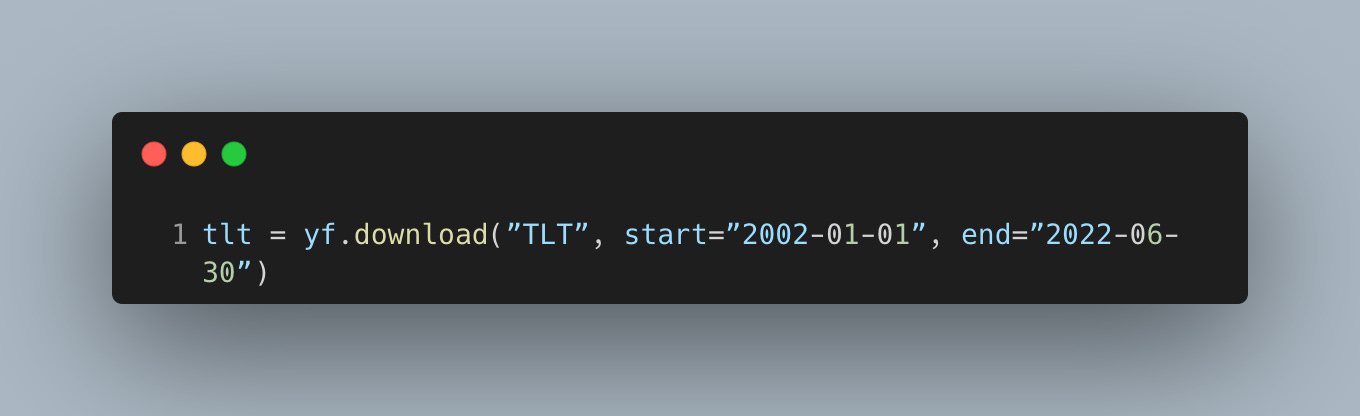
Download prices and engineer features
Pull a long history of TLT daily data so we can evaluate whether a month-end effect persists across multiple rate regimes and market cycles.
Using a wide window reduces the chance that an apparent edge is tied to one period. The Adjusted Close series incorporates distributions, which matters for ETF total return proxies. A clean, time-indexed DataFrame also ensures our calendar grouping aligns strictly to trading days without manual date handling.
Create core features: log returns for additivity and calendar keys to aggregate behavior by day of month and by year.
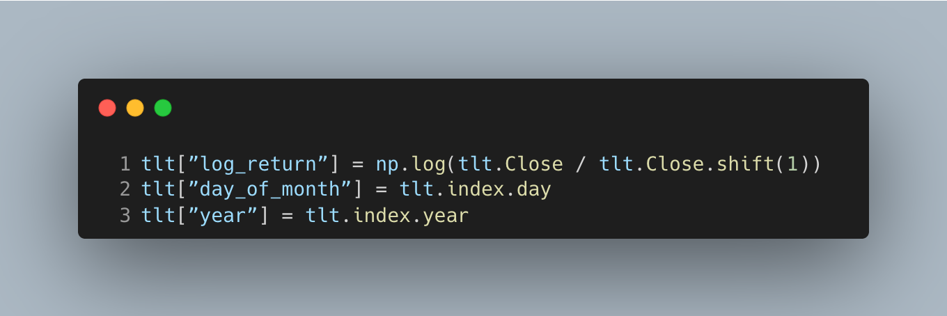
Log returns add over time, which makes simple sums and means meaningful for diagnostics without compounding artifacts. The shift aligns returns to information available at the close, avoiding lookahead. Storing day-of-month and year upfront lets us group quickly and check stability by calendar bucket and by regime.
Define calendar windows and signal
Tag the first and last week windows, then form a naive daily spread (last-week minus first-week) to represent a long-last/short-first posture around month-end.
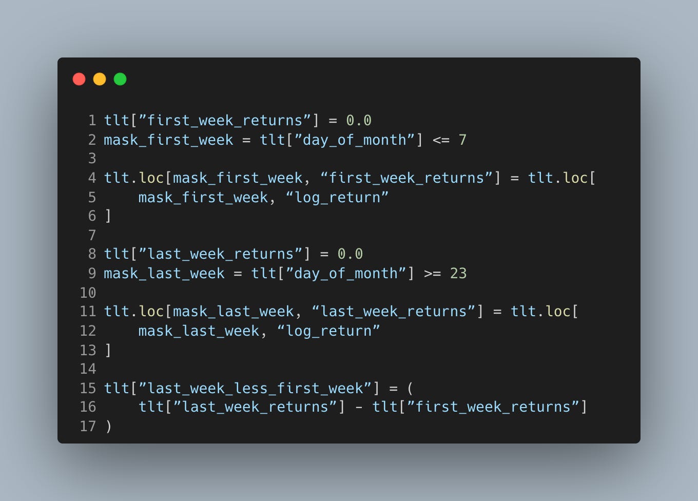
Zeroing out non-window days isolates the two intervals we care about and keeps the spread focused on the hypothesized flow pattern. The cutoffs are simple by design; coarse buckets often survive better than finely tuned ones in out-of-sample tests. Treat this spread as a diagnostic signal, not a finished strategy—it ignores costs, borrow, and position sizing.
Plot diagnostics and cumulative performance
Inspect average log returns by calendar day to see if late-month days show a positive tilt consistent with turn-of-month flows.
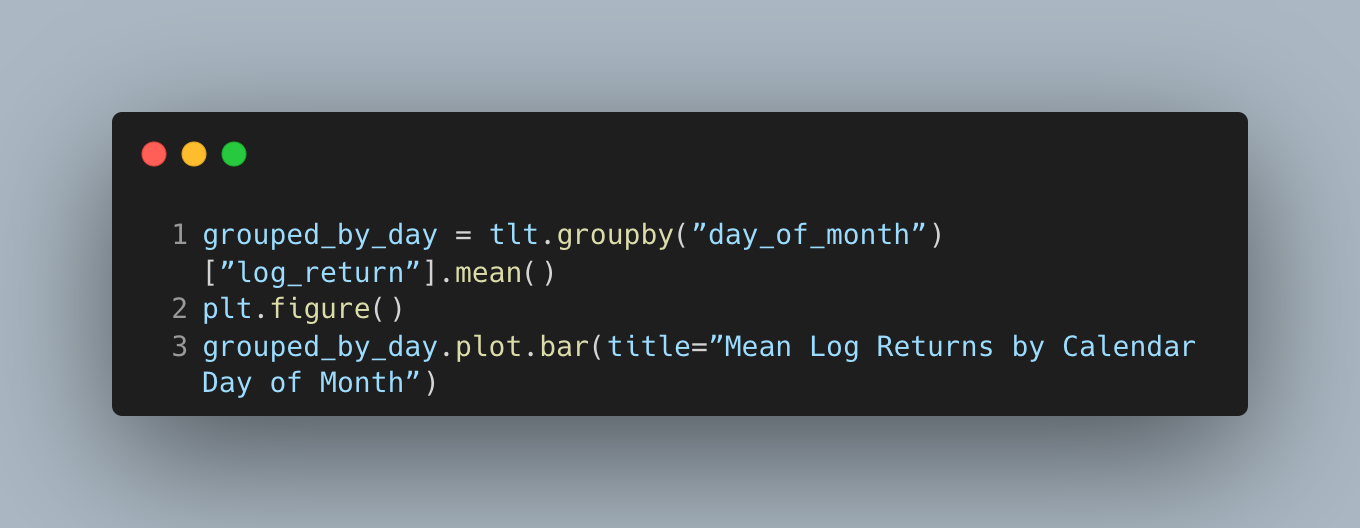
The result is a chart that looks like this.
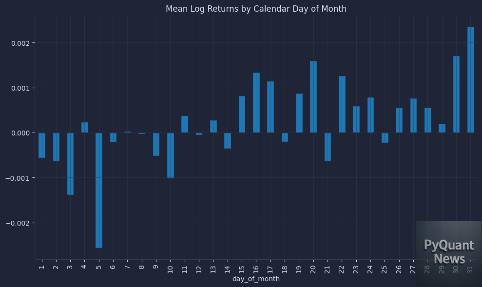
Binning by day-of-month turns the story into a measurable profile and helps us spot whether late-month bars cluster positive. Expect noise on individual days; we care about a coherent pattern around the last week. If nothing shows up here, it’s a sign to stop early rather than force a trade idea.
Check yearly averages of the last-minus-first-week spread to assess whether the effect persists across different environments.
The result is a chart that looks like this.

Persistence by year matters more than a strong full-sample mean because fragile effects often vanish outside a lucky window. A mostly positive tilt with manageable dispersion suggests a structural flow rather than a transient anomaly. Large swings or alternating signs hint at noise or regime dependence.
Examine cumulative yearly sums of the spread to see if the edge builds steadily across time rather than relying on a few outlier years.
The result is a chart that looks like this.
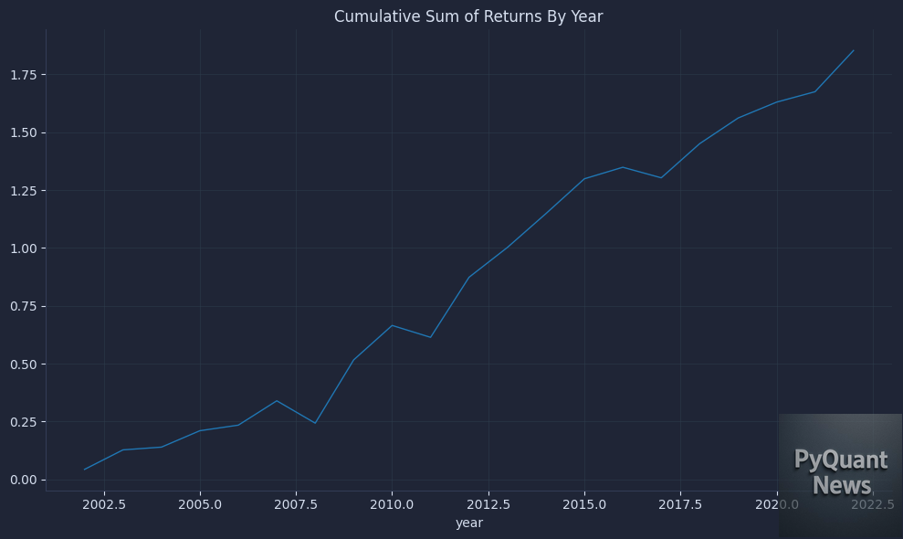
A monotonic or steadily rising curve across years is a healthier signal than one dominated by a single spike. This view compresses within-year noise and highlights decade-level contribution. If the slope decays or reverses, the edge may be weakening or sensitive to rates regimes.
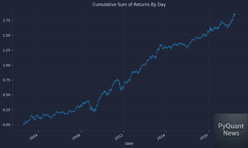
Plot the daily cumulative spread to visualize path, drawdowns, and whether gains arrive around the targeted windows.
The result is a chart that looks like this.

This is the closest thing to an equity curve for our diagnostic, though still pre-costs and unconstrained. We look for consistent step-ups around late-month windows rather than choppy reversals. If this curve is fragile, the next step is to refine data hygiene and costs before allocating more research time.
Your next steps
Now you can test month-end seasonality end to end with clean TLT data, log returns, day-of-month groupings, and a simple last-week minus first-week schedule. This matters because it turns a story into a cost-aware check you can repeat across instruments, judge stability and size, and make a clear trade-or-discard decision.